Figma to Elementor Responsive Breakpoints Explained
Use a breakpoint when the content needs a layout change. Figma frames are useful samples, but a working site must also behave well at widths between those samples.
Published 25 October 2026 · Syed Rizwan Khan
Treat design frames as samples
Visitors use different viewport sizes, zoom levels and text settings. Record which relationships stay consistent: content width, side spacing, reading order, image ratios and heading hierarchy.
Then identify changes that need a breakpoint, such as stacked columns or a different navigation layout. A breakpoint should solve a layout problem rather than simply copy a frame dimension.
Inspect the current configuration
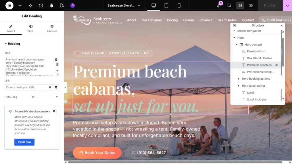
Use the project’s existing Elementor breakpoints before introducing new ones. Responsive controls and additional device settings are available in Site Settings. Do not assume a remembered default matches this site.
Record existing overrides. A device-specific value can take precedence over the base value, so inspect the affected control before repeatedly changing desktop settings.
Let the content reveal the change
Reduce a wide viewport until navigation, headings or cards become cramped. The layout change belongs before content collides or becomes hard to use. Check the longest label and most demanding content, not only the shortest sample.
Increase the narrow layout as well. Avoid leaving unnecessarily narrow text columns on medium screens. Add another breakpoint only when it supports a distinct behavior.
Make mobile decisions explicit
Specify stacking, alignment, image crops and navigation. Maintain a coherent reading and keyboard order. Replace unsuitable fixed widths with responsive values.
Check long URLs, buttons and fields. Hiding horizontal overflow may conceal a broken element. Find the element that is wider than the viewport before choosing a fix.
Test beyond the editor
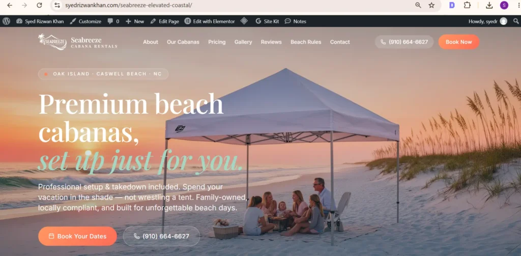
Preview the rendered page at representative desktop, tablet and mobile widths, just above and below breakpoints, and at intermediate sizes absent from the design.
Compare scroll width with viewport width to detect overflow, then inspect the specific offender. Test menus, focus visibility and forms. Record dimensions so later checks can use the same conditions.
When mobile designs are unavailable
Propose responsive behavior for review. A sensible adaptation is still an implementation decision; it is not a missing source frame you can claim to have matched.
Documentation and next steps
See Elementor responsive editing for current controls. Related: the build workflow and editable templates. Discuss a build through the Figma service.
Have a design you need built?
Send the source design, website URL and required functionality. Scope and turnaround are confirmed after review.